
The Lumberjack
by jbyron
Piece number 2 on the path to my solo show. I don’t normally have the clearest of visions when i do my paintings. I have a general idea, normally laid out in the computer in advance, giving me direction – but for me, it’s like driving in a storm – and i hate windshield wipers, they distract more than help. plus, they cover up the sound of my music, so i just plow forth in hopes that i reach my destination alive (and without killing others) with the knowledge that, if i do, at least death was accompanied by a decent soundtrack. Wow. That ridiculous analogy was just so i could mention that for this particular piece, i had a pretty good idea where i was going. I should mention that i used an entire can of orange spraypaint to get that background, which is actually made up of many colors including orange vehicle paint and fluorescent pink… specs of blue too. I killed an air filter on my way to getting that color just how i wanted it (sorry Emily) – It sucked all the paint from the air and died – better it than me. I should stop talking about death and get on with it.

This piece was inspired by a photo i found online that i manipulated in photoshop. And this painting, as i mentioned in the previous post, is the first in my attempt to try new things. I do a lot of illustration work in my freelance life but hardly ever in my fine art… this was not a conscious thing. So i decided to use less stencils and draw more. The results have been mixed so far. Still perfecting something that works best when it looks far from perfect… figure that out.
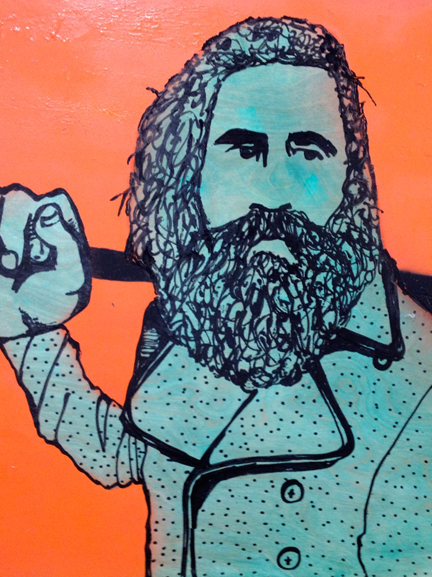
It’s masculine i think. Although, i was really tempted to paint the blade pink – not because of any masculine/feminine thing, i just thought the pink would look good against the orange. Alas, as you can see, i didn’t. I always intended for the blade to be a mixture of metallic silvers, chromes and antiques. So, stick with your guns i guess. I like working with reflective properties. I have 2 paintings coming up that incorporate a lot of chrome but i’ll get to that in a few weeks.
Here’s another view.
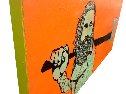
I always stress about the sides of my paintings. I don’t like to just bleed off the color onto the sides. I want the sides to fight for your attention but still give muscle to the image. This one was easy. That acid green looked dope with that orange; just the cans sitting beside each other looked good on my shelf, i knew it was meant to be.
This method goes quicker than the stencil thing. I figured it would be the other way around. But the stencils require foresight and finesse. With these paint pens, i just dive in – and if i mess up, who’ll know, that’s the benefit of embracing a messy style. I’ll say this, drawing with these steel tipped paint pens on wood where, in some cases, i have to redraw the same line several times is killing my petite, girly hands. I have to take breaks – how pathetic is that? I’m still using stencils to separate elements, foreground and background for example, and in future paintings i hope to marry what i’ve learned of stencil art over the years with this new illustrational style. We’ll see.
Just realized that the photos i’m using aren’t actually the most recent version of this painting. I’ve put a slight bit of pink and purple around the handle since these shots were taken. Doesn’t make a big difference, just a touch of interest. I’ve also put a bit more detail on the face. Guess you’ll have to use your imagination.

Anyway, hope you dig it. Thanks for reading.
